27/09/2026
Choosing Artisan Honey Packaging Labels
With a jar of artisan honey, the customer often reads the label before tasting the product. The artisan honey packaging label is therefore not simply decoration: it simultaneously communicates the product's origin, helps with selection, and withstands the tests of transport, cool storage, or sticky honey-covered hands. A well-chosen label makes even small-batch products look more professional, without creating unnecessary inventory risk.
What Makes an Artisan Honey Packaging Label Work?
The first task of a good label is readability. The honey type—for example acacia, rapeseed, linden, or wildflower honey—should be immediately identifiable. This can be followed by information that builds customer confidence: the producer's name, place of origin, net weight, and other mandatory markings for the product. The second task is differentiation. On shelves of producer honeys, many labels use honeycomb patterns, yellow shades, and rustic typefaces. These can work, but alone they don't create a recognizable brand. A consistent color palette, clearly readable brand name, and uniform label format make the product recognizable even when the customer buys several honey varieties from the same producer. The third consideration is production reality. If the offering changes seasonally, new flavors appear, or gift packages are prepared, it's not practical to store several thousand pieces in inventory. The advantage of small-batch digital printing is that you can test a new label from just 10 pieces, then reorder the proven version in larger quantities.
First Choose Size and Shape According to Your Jar
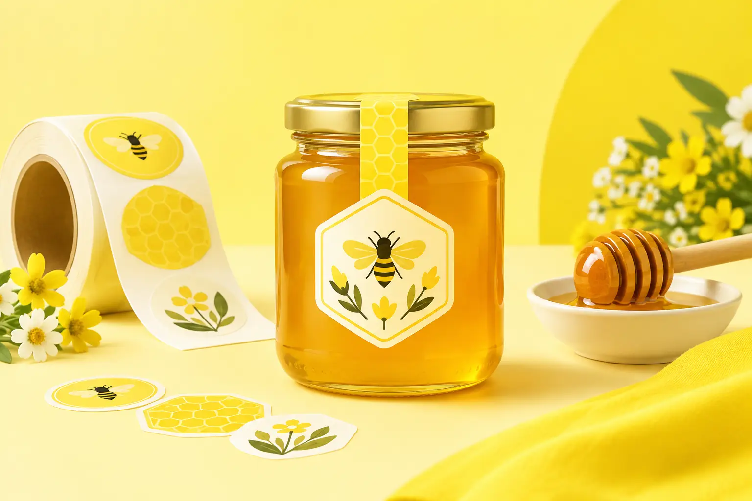
The label size is determined not by the graphics, but by the jar. Measure the width and height of the flat, adhesive-friendly surface. The label should not run onto strongly curved parts, as it may peel off, wrinkle, or become less readable over time. Especially for narrow jars, it's worth keeping the main label smaller, placing detailed information on a separate back label instead. The rounded rectangle is the safest and most economical choice for most honey jars. It makes good use of the surface, is easy to arrange product information on, and is less prone to peeling at the corners. A circular label can appear strong and artisanal, especially on the lid or smaller jars. A custom contour-cut shape is justified only if it truly strengthens your brand identity, for example with your own bee or hive motif. However, a more complex shape leaves less space for text on a smaller surface. The lid label is a good supplement but rarely replaces a front label. It can be used for your logo, seal-like graphics, or seasonal messages. If the jar is intended as a gift, the lid and front label together can create a more premium appearance.
Material Selection: The Honey Environment Tests the Label
A paper-textured label can convey warmth and natural feel, but for honey packaging, durability is equally important. Honey dripping on the jar, damp storage, friction during transport, and frequent handling quickly reveal the limits of inferior materials. Premium self-adhesive vinyl is a practical choice if the label needs to be moisture-resistant and durable. Water-resistant, UV-resistant finishes are particularly advantageous if the product is heading to market, a fair, a gift box, or a long-distance shipment. Lamination can provide additional surface protection and reduce the visibility of scratches. A glossy finish makes colors more vibrant and works well with modern, high-contrast graphics. A matte finish feels more understated and natural, and doesn't shine under bright light. The choice here is not purely a matter of taste: if product photos are important for your online store, or if the label frequently ends up under market lighting, it's worth requesting sample pieces of both finishes or testing in small batches.
An important distinction is that an external jar label is not food-contact packaging material. The adhesive and printed surface should be on the outside of the jar, and always check the packaging solution used for compliance with applicable food industry regulations.
Information Hierarchy Matters More Than Decoration
A honey label is not a catalog page. If all information is equally prominent, the customer won't quickly find any of it. It's worth thinking in three levels. First, your brand name and honey type should appear. At the second level, the net weight, origin, or a brief producer message should have space. Detailed information—such as shelf life, batch identification, storage notes, and distributor details—can go on the back or in a smaller text area.
Food labeling requirements may contain specific rules depending on country and product type. For honey, the designation, net quantity, shelf-life information, batch identification, origin, and producer or distributor details are typically essential. Always check current Hungarian and EU regulations before final printing, especially if you sell to multiple countries or offer complex honey products.
Too-small font size is a common mistake. Even if all the data fits on the graphic, if the customer can only read it with a magnifying glass, you've failed. Leave adequate white space, use sufficient contrast, and avoid light yellow text on white or gold backgrounds. The honey's color is itself a visual element, so on transparent glass, a clean, simple label often works better than an overcrowded illustration.
Print-Ready Files: How to Avoid Delays and Reprints
The best starting point is a vector PDF, AI, or SVG file, because these remain sharp when resized. For raster graphics, use at least 300 dpi resolution at the final print size. Don't save your logo from a screenshot or social media profile picture, as such files often look lifeless in print. Let the background color or graphics extend beyond the cutting line by a few millimeters. This bleed helps avoid thin, unwanted white lines at the cut edge. Important text, barcodes, and logo elements should not be placed too close to the edge. On a circular label in particular, watch that longer words and data rows don't fall on the curved rim.
Colors visible on screen may differ from printed colors. This is natural, because the display emits light while printing works with ink. If brand color is critical, use consistent branding files and test a smaller order.
On the GetStickerz online configurator at getstickerz.eu/#konfigurator, after selecting size, shape, material, and quantity, the price is visible immediately, and files are checked within 24 hours. If needed, a print preview can be approved before production. Visit getstickerz.eu/#termekek to explore all available products.
Two Labels or One? Ordering Strategy Matters Too
With a small selection, a single, well-organized front label means simpler application and lower per-unit cost. However, if your product family consists of multiple honey varieties, a two-label system is more flexible. You can create a shared branded main label, paired with different back or smaller supplementary labels for each honey type. This way, brand identity stays constant while only the variable information needs to be reprinted. The same approach is useful for seasonal editions, corporate gifts, and reseller packaging.
You don't always need to design a completely new look. Often, a color code, a clearly visible variety name, or a small label referring to a limited edition is enough for customers to immediately understand the difference.
Before ordering, apply a test print to the actual jar and look at it in natural light too. If the label stays flat, the information is readable in an instant, and the surface remains neat after several uses, then your packaging is ready to authentically represent the quality of your honey from the first glance. For further questions or custom requests, visit getstickerz.eu/kapcsolat to get in touch with our team. You can also browse more details on our website at getstickerz.eu/rolunk.