
04/08/2026
How to Create a Beer Bottle Label Professionally
First Impressions Happen on the Shelf, Not in the Glass
A well-brewed beer first meets its customer not in a glass, but on a refrigerator shelf. Your label must simultaneously build brand identity, provide guidance, and withstand moisture, cold, and wet hands. If you're looking to create a beer bottle label professionally, appearance is just the first decision. The right size, material, mandatory information, and print file together deliver truly professional results.
Design for the Bottle, Not the Screen
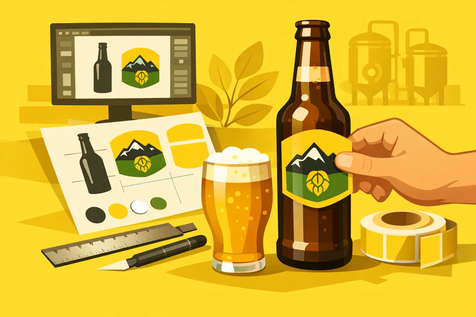
Beer bottle shapes vary by type—the labeling surface of a 330 ml long-neck differs significantly from a stocky 500 ml bottle. Before opening any design software, measure your actual bottle. Use a measuring tape to determine the bottle's circumference where the label will sit, and measure the straight, easily-adherable height as well.
For wraparound labels, don't automatically use the full circumference. Leave a few millimeters of space so the edges don't overlap, and you'll have an easier time applying the label. For front labels, the widest, optically centered part of the bottle works best. A label that's too tall can easily fold over the curved shoulder where it might wrinkle or peel.
It's worth testing your first measurements on paper. Print at 100%, cut it out, and smooth it onto the bottle. This simple test quickly reveals if text is too close to the edges, if the label wraps too far around, or if your design isn't visible where customers will grip the bottle.
One Label or Multiple Elements?
For small runs, separate front, back, and neck labels offer flexibility and economy. The front can showcase the brand name, beer name, and style. The back accommodates details like alcohol content, volume, ingredients, allergen information, and producer data. A neck label adds premium appeal, but only if it doesn't overcrowd the bottle.
A single wraparound label is more economical and gives more room for storytelling or graphics, but requires more precise application—especially for hand-labeling. If you're filling multiple beers in the same bottle, matching the base layout with different color codes creates faster production and a more recognizable product family.
Making Your Label Sell the Product
Within seconds, the label must communicate what's in the bottle. The brand name, beer name, style, and brief flavor profile should be readable at first glance. Labeling an IPA, lager, stout, or wheat beer isn't a minor technical detail—it helps customers choose, especially those unfamiliar with your brewery.
Creative illustration, bold typography, and distinctive color work, but they don't replace visual hierarchy. Not every element should shout equally. Choose one main focus—perhaps the beer name or a strong graphic motif—and support it with smaller information blocks. Too many typefaces, weak contrast, and tiny white text become especially difficult to read once a cold bottle comes out of the fridge.
For seasonal or limited releases, you don't need to rebuild your entire brand identity each time. Keep the logo, label shape, and information placement constant while varying color, illustration, or the beer name. This helps customers instantly recognize your brand while giving the new release a fresh feel.
Mandatory Information Needs Space Too
A beer label is a food label, so it must comply with regulations in your sales market. For distribution in Hungary, all mandatory information must appear in Hungarian and be clearly legible. Your exact obligations depend on the product, alcohol content, sales country, and packaging method, so check with an expert or relevant authority before finalizing the content.
When designing your label, budget space for the following:
- Product name and beer style
- Nominal volume (e.g., 330 ml or 0.5 l)
- Actual alcohol content (e.g., 5.2% vol.)
- Clear allergen labeling (e.g., barley malt)
- Responsible food operator name and address
- Best-before date, batch identifier, and storage information if required
- Other labeling required in your sales country
Above certain alcohol levels, ingredient lists and nutritional labeling rules may differ from other foods, but allergen labeling remains critical. Don't leave this information block for the last minute. When mandatory text is added to a finished design, the result often has too-small fonts, a cramped back label, or compromised graphics.
For date and batch information, you have two options. You can print variable data directly onto labels, which works well for small runs. Alternatively, use a separate date label or mark it directly on the bottle or cap. The latter is practical if you're using the same design for multiple production batches, though the marking must remain readable even when cold and wet.
Material Choice: The Cooler and Moisture Win
Paper labels offer a classic, artisanal look, but a beer bottle's real world is harsh. A bottle fresh from the cooler condenses, a bottle in an ice bucket becomes wet, and transport friction challenges the surface. If your label needs to stay crisp and intact in these conditions, water-resistant vinyl is the safer choice.
Glossy vinyl makes colors pop and suits strong, contrasting graphics. Matte finish feels more restrained and premium, with less reflection under bright retail lighting. Lamination offers extra protection against scratches, moisture, and UV light. Not every product needs it, but it's well justified for events, outdoor sales, or extended shelf life.
Before applying your label, the bottle should be clean, dry, and at room temperature. A label applied to a freshly chilled, sweaty bottle may not stick reliably. For hand-labeling, consider a positioning template, especially if dozens of bottles need identical height and alignment.
Print-Ready Files: Where Sharpness and Precision Matter
Graphics that look sharp on screen can appear fuzzy in print if sourced from low-resolution images. For photos and raster elements, work at 300 dpi at final size. Create logos, line art, and text as vectors whenever possible—they'll stay sharp when scaled.
In your print file, add 2-3 mm bleed on every edge where background color or graphics reach the label edge. This is necessary for cutting tolerances. Without bleed, a thin unwanted white stripe can appear at the edges. Keep important text, barcodes, and logos at least 2-3 mm away from the cutting line.
Request or use a CMYK color profile if your printer requires it. Bright neons and saturated display colors designed in RGB may appear muted in print. For small black text, don't mix multiple colors to create black—it will look less crisp at small sizes. Single, pure black works best.
For final export, a print-ready PDF with embedded fonts or text converted to outlines is the safest format. If print preparation isn't routine for you, file review prevents many mistakes. When you visit getstickerz.eu/#konfigurator to order, the file check and optional print preview serve as good anchors before your entire series goes to production. Especially for your first order, it's worth approving the preview—label size, cutting, and information placement become truly visible on the physical bottle.
Start Small, Order Big With Confidence
Ten, twenty, or fifty labels aren't just starter quantities—they're market tests. Put a few bottles out for tasting, take product photos in natural and retail lighting, and observe what people notice first. If the beer name gets lost, the style isn't clear, or the back is unreadable, it's cheaper to refine in the next small batch than to live with hundreds of finished labels. Visit getstickerz.eu/#termekek to explore your options.
If everything checks out, you can confidently order larger quantities. Visit getstickerz.eu/rolunk to learn more about our process, or reach out via getstickerz.eu/kapcsolat if you have specific questions about your beer label project.
The Mark of a Professional Label
A good beer bottle label isn't professional because it fills every empty surface. It works because it fits the bottle's shape, communicates necessary information clearly, and delivers the same quality when cold from the fridge as the beer inside represents.