
12/11/2026
How to Design a QR Code Sticker That Actually Works
Introduction
A QR code sticker fulfills its purpose when a customer scans it in one motion—not when it just looks good on the design. A code that's too small, shiny lamination that glares on reflective surfaces, or poor placement is enough to keep a buyer from reaching your product page, instructions, or discount. If you're asking how to design a QR code sticker, the first consideration should always be reliable scannability, followed by brand appearance and durable construction. Visit getstickerz.eu/#konfigurator to explore your options for creating professional QR code stickers.
Start With the QR Code's Purpose
Before choosing size, shape, or material, decide what happens after scanning. The QR code can direct to a webshop product page, reorder page, user manual, video, social profile, or a seasonal campaign. A sticker can contain multiple points of information, but ideally, the code should lead to a single, clear next step.
For example, on a handmade honey label, the QR code could lead to the producer's introduction page and details about the specific honey variety. On a cosmetic product, a usage guide or detailed ingredient information might be useful. A brewery could use it to drive the next order with a discount, but only if the landing page loads quickly on mobile and delivers a truly relevant offer.
Longer, complex URLs require more data, resulting in a denser QR code. Denser patterns are harder to read at smaller sizes. With a short URL created on your own domain for redirects, you'll get a cleaner code and a modifiable landing page later. This is especially useful if the sticker remains in circulation for a longer time while campaigns or product information changes.
How to Design a QR Code Sticker at a Readable Size
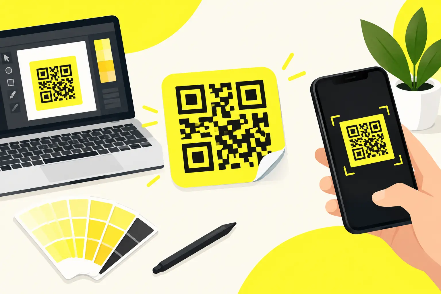
The question with a QR code isn't about impressive graphics around it, but about technical reserves. Leave a free, single-colored area around the code—this is called the quiet zone. If patterns, text, or borders get too close to the code, the phone camera struggles to recognize its boundary.
On smaller packages, the printed QR code should typically not be smaller than 15 x 15 mm, but that's just a starting point. For denser codes, outdoor use, or less-than-ideal scanning conditions, a 20-25 mm size offers greater safety. If your sticker serves information readable from a distance—such as part of a store promotion or event decoration—you'll need a considerably larger code. Always adjust the final size to the real-world usage situation.
On a 30 ml cosmetic jar, there's little flat surface, so the code must be positioned to avoid strongly curved areas. On a glass bottle, consider the label's curve; on transparent packaging, account for how the inner contents might affect contrast. Next to the square QR code, rectangular or square labels work well, but it's not mandatory to stick with this.
With circular stickers, maintain adequate distance from the cutting line. With custom die-cut stickers, it's especially important that the code doesn't end up in narrow, curved, or pointed areas, because the visual boundary and cutting tolerance together can harm readability.
Contrast: No Compromises Here
The safest solution remains a dark QR code on a light, single-colored background. Black code on white isn't an industry standard by accident—it delivers high contrast, works with many phone cameras, and is predictable in print.
Brand colors can be used if they maintain proper contrast. A dark blue code on a light cream background often works, while a pale yellow code on white is usually risky. Avoid gradient QR codes, transparent backgrounds, metallic or heavily patterned bases. These may look impressive on screen, but after printing and in varying lighting conditions, they often cause problems.
Placing a logo on the QR code is also a compromise. A small centered logo might allow the code to still function with appropriate error correction levels, but every additional graphic element reduces the safety margin. If brand identification is important, it's often better to place the logo next to the code rather than inside it. This keeps the sticker branded while making scannability less dependent on phone type and lighting conditions.
Let Text Give Reason to Scan
A bare QR code means nothing to many customers. A brief, specific call-to-action significantly increases scan rates. "More information" is generic, while "See the ingredients," "Reorder with 10% discount," or "Watch the how-to video" promises clear value. Don't try to cram every message onto the sticker.
The product name, mandatory markings, storage information, and QR call-to-action together can quickly overwhelm a small surface. In such cases, use the QR code on a separate small sticker, on the back, or on a package closure label. The separate solution provides more space and prevents divided customer attention.
The call-to-action text size should be comfortably readable from the actual usage distance. A bottle label needs different sizing than a promotional sticker on a mailing package. Overly thin fonts, cramped lines, and low contrast cause problems here just as they do with the code itself.
Choose Material for the Usage Environment
Sticker material directly affects how long the QR code remains scannable. For indoor, short-term campaigns, a simple paper label may work, but for damp, refrigerated, outdoor, or frequently handled products, vinyl is a more reliable choice.
Water-resistant and UV-resistant vinyl stickers withstand splashing water, wear, and sun exposure better, making them practical for beverage bottles, cosmetics, shipping packages, and outdoor promotions. Glossy surfaces can create a vibrant, premium feel, but reflect strongly in direct bright light. If the QR code will be scanned in stores, at markets, or outdoors, a matte finish often provides more predictable results. This doesn't mean glossy stickers are a bad choice—rather, the usage situation decides.
The same surface behaves differently in product photos and in real shelf environments. With lamination, the print gets additional protection. This is especially worthwhile if the sticker receives heavy handling, moisture, or friction. When choosing lamination, also consider gloss—matte lamination can reduce shine while protecting the graphics.
Visit getstickerz.eu/#termekek to see the full range of materials and finishes available.
Prepare Your Print File Correctly
Handle the QR code preferably as a vector, in formats like SVG, PDF, or AI. This keeps the square edges sharp regardless of size. For raster graphics, use appropriate resolution, but don't enlarge a low-resolution image later, as edges may blur.
Don't place the QR code near the cutting line. Safety margins protect it from manufacturing tolerances or misalignment that might disturb the code's edge. With graphics bleeding from the background, bleed must also be set correctly, while the quiet zone around the code remains consistently clean.
Before printing, verify the actual destination URL, then test the code with multiple phones. Don't just try it on your computer screen—print it at the planned size and test it. Scan it in normal indoor light, with stronger side lighting, and if relevant, on a curved sample piece as well. This few minutes is far cheaper than an entire print run that customers can't use.
Make It Verifiable Before Production
Even with small initial orders, consider the first batch as a trial run, especially with new packaging, new materials, or new QR target pages. From just ten pieces, you can check size, adhesion, and scanning experience on real products before ordering larger quantities.
In the GetStickerz online configurator, after selecting size, shape, vinyl surface, and lamination, the price appears immediately. Checking your uploaded file helps filter basic errors like inadequate resolution or missing bleed before production. For riskier projects, print proof approval provides additional security.
For more information and to start your project, visit getstickerz.eu/#konfigurator or check out getstickerz.eu/kapcsolat to discuss your specific needs with our team.
Conclusion
A professional QR code sticker isn't professional because it's full of effects. It's professional because it's created at the right size, provides clean contrast, withstands use, and guides the customer exactly where you want them to go. Design for the real environment, test at finished size, and your sticker becomes a quiet but measurably useful part of your packaging.