
25/10/2026
Setting Up Print Bleed for Stickers
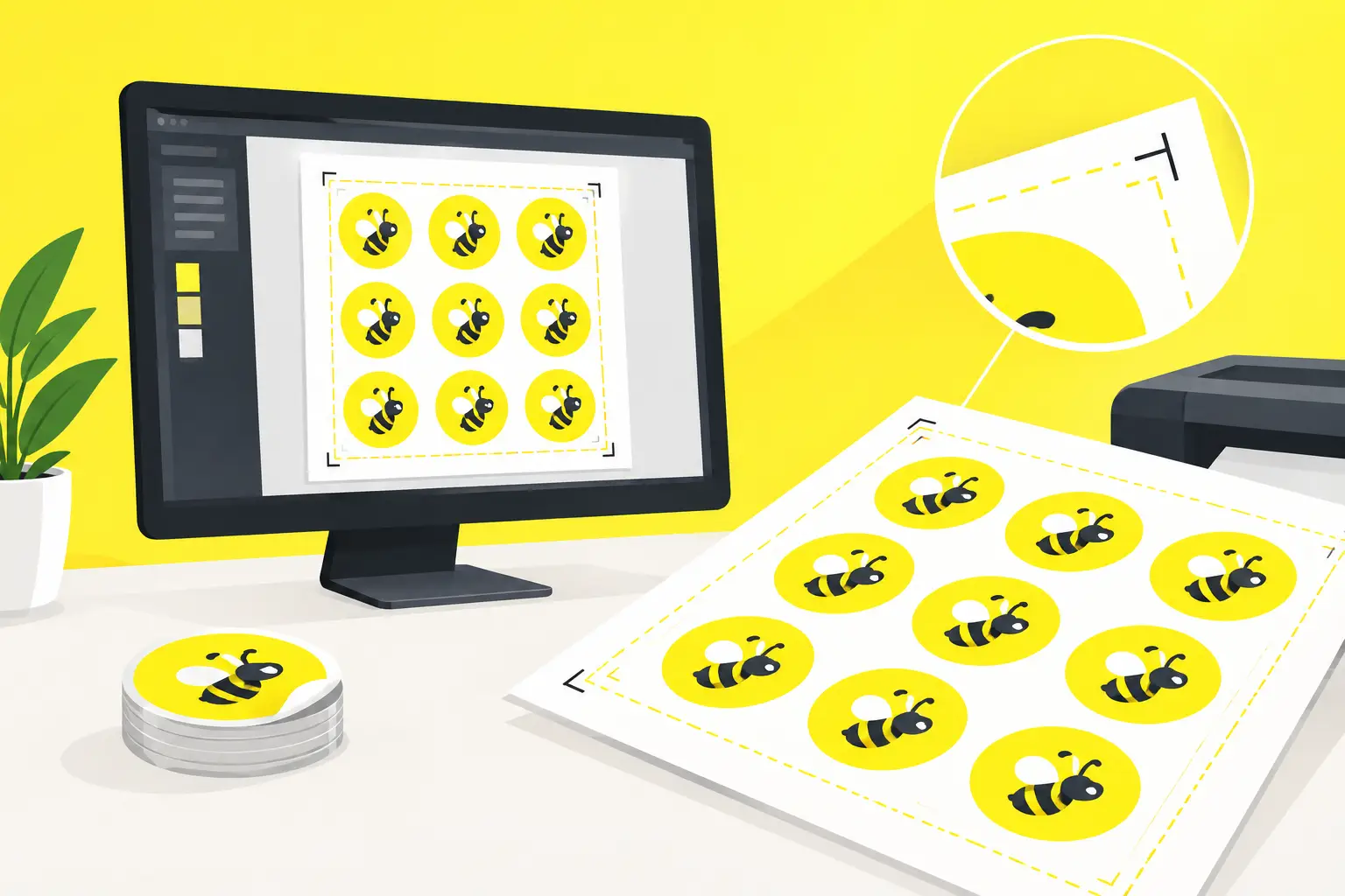
When working with dark backgrounds, color gradients, or photos that extend to the sticker's edge, even a barely visible cutting deviation can leave an annoying white stripe along the edge. Setting up print bleed for stickers addresses exactly this risk: the graphic extends beyond the finished size, so minimal cutting tolerance won't ruin the final result. This isn't just a technical detail. A product label or promotional sticker is often the first physical encounter with a brand. If color is missing at the edges, even carefully designed packaging appears less professional. Setting up bleed correctly is simple if you handle the finished size, cutting contour, and safety zone separately.
What Does Bleed Mean in Sticker Printing?
Bleed is the graphic allowance that extends beyond the sticker's final cutting line. The printer outputs onto a larger sheet or roll, then a cutting machine separates the stickers. Although cutting is highly precise, there is always minimal positioning tolerance in the manufacturing process. For example, if a 50 × 50 mm square sticker has a completely yellow background, it's not enough to create the file at exactly 50 × 50 mm. The yellow background must also extend beyond the cutting line. This ensures color reaches the sticker's edge even if cutting goes slightly inward or outward.
Bleed is not the same as a safety zone. Bleed extends outward, beyond the finished size. The safety zone, by contrast, is inward: important text, logos, barcodes, and fine details should be placed here so they don't come too close to the cut edge.
Setting Up Print Bleed for Stickers Step-by-Step
For most stickers, 2–3 mm bleed is a safe starting point. For a simple, larger rectangular label, 2 mm might be sufficient. For small, custom die-cut, detail-rich, or dark background stickers, 3 mm provides more manufacturing room. Always follow the specific technical specifications for the product, especially if the sticker shape is non-standard.
1. Start from the Finished Size
First, establish the sticker's actual, cut-out size. If the label is 70 × 100 mm, treat this as your finished format. Then add bleed on all sides. With 3 mm bleed per side, your total graphic working area will be 76 × 106 mm. For circles, ovals, or custom shapes, the same principle applies. Bleed should run continuously around the entire contour, not just on certain sides of the graphic. The background color, pattern, or photo must extend continuously past the cutting line.
2. Extend Background Graphics Past the Cut Line
Always extend elements that fill the entire surface to the end of the bleed. This includes background color, texture, photograph, and any graphic detail that needs to reach the finished sticker's edge. A common mistake is designing the colored background to end exactly at the cutting line because it looks perfect on screen. However, in printing, cutting doesn't align with monitor pixels. Without bleed, even the smallest deviation is visible, especially with black, dark blue, bright red, or saturated green backgrounds. If your sticker is created with a white base and white border, bleed still plays a role. In this case, the white border must be deliberately designed with appropriate width and aligned to the cutting contour. It shouldn't be a accidentally left-behind white margin that forms the frame.
3. Maintain Internal Safety Distance
Critical content shouldn't be placed on the cutting line. As a general rule, maintain at least 2 mm internal safety zone, but with small font sizes, narrow typefaces, or complex contours, 3 mm is a better choice. This is especially important for product labels. A barcode, ingredient list, net weight marking, or web address cannot be too close to the edge. Even text that's technically readable won't create a trustworthy impression if cutting makes it appear cramped, crowded, or partially cut off. For custom-shaped stickers, the safety zone isn't always an even rectangle. On narrow parts of a star, cloud, mascot figure, or logo contour, more space must be left. In these cases, it's worth checking the relationship between the cutting line and the graphics at high magnification as well.
4. Make the Cut Line a Separate, Unambiguous Element
For die-cut stickers, the cut line defines the finished shape's outline. It must be clean, closed, and unambiguous. The cut line should not be duplicated, should not contain unnecessary nodes, and should not intersect important graphic elements. In most workflows, the cutting contour appears on a separate vector layer or with a separate spot color. Exact naming and technical setup vary by printer, so check the specific guidance for your product before uploading files. If the ordering system provides a template, use it rather than setting the contour based on assumptions. For kiss-cut vinyl stickers, the carrier sheet remains, and only the sticker's top layer is cut through. For die-cut stickers, the sticker itself is individually cut. The bleed logic is the same in both cases, but with die-cut formats, the outer contour's visual role is usually stronger, so edge checking is even more critical.
What File Settings Should You Choose?
Bleed only works reliably if the entire file is print-ready. For vector elements, PDF is usually a good choice because logos, text, and lines remain sharp. For photos and raster graphics, 300 dpi resolution calculated for the final size helps avoid grainy or blurry prints. In color management, CMYK color mode produces more predictable printing results than RGB. On screen, neon-bright, highly saturated shades often look stronger than they appear on paper or vinyl. If a brand color is particularly critical, it's worth requesting a proof print or a print preview sent for approval. Convert text to outlines when possible, or ensure the PDF embeds all necessary fonts. This way the layout won't change when the file is processed on other systems. Check transparency, shadows, and thin lines even after export, especially for smaller labels. Visit getstickerz.eu/#konfigurator to review your settings before ordering.
Common Mistakes That Cause Problems Even with Proper Bleed
Correct allowance alone can't fix every design problem. One typical error occurs when bleed is present but critical text is still placed too close to the cutting line. Equally common is when the background isn't continuous: a photo or pattern only partially extends into the bleed, so color changes or empty bands might appear at the edge. A too-thin white frame can also cause problems. If the white border is an intentional design element, make it wide enough to appear even despite small cutting variations. With narrow 0.5–1 mm frames, this is rarely guaranteed, especially with curved or complex contours. Avoid very fine details directly at the sticker's edge. A hair-thin line, small icon, or delicate pattern may appear differently due to cutting and the material's natural surface. Matt lamination, for example, achieves a more restrained, premium effect, while glossy surfaces emphasize stronger colors and contrast. The choice depends on whether you're creating product labels, outdoor promotional stickers, or brand gifts. Visit getstickerz.eu/#termekek to explore different finishing options that work best with your design.
Checking Before Upload
Before uploading, view your file at 100% magnification and also at full size. At magnification, you can review contours, text, and thin lines well; at full size, proportions, margins, and visual balance become clear. Enable the cutting line and bleed guide visualization, then verify that every edge-running element truly extends past the cut. Always compare the size specified in the online configurator with your file's finished size. Quick price calculation is most helpful when your chosen material, shape, and quantity already match actual use. GetStickerz file checking can provide additional security, but well-prepared graphics support faster approval and more predictable manufacturing. If you're uncertain about an unusual shape, don't skimp on bleed by a few millimeters. Proper allowance is nearly invisible at the printer; its absence is immediately noticeable on the finished sticker. For more information about our services and to get started with your project, visit getstickerz.eu/rolunk or contact us at getstickerz.eu/kapcsolat.