
23/10/2026
What Resolution Do I Need for Label Printing?
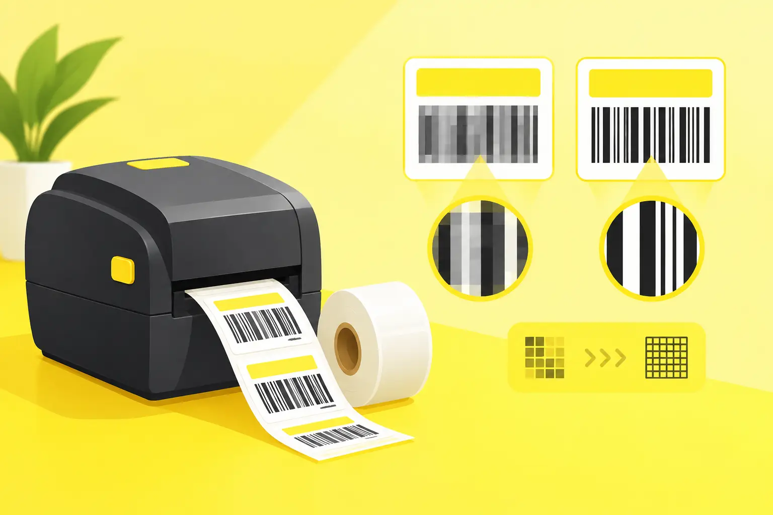
On a 5 cm label, a blurry logo, pixelated text, or illegible ingredient list immediately diminishes the product's impact. So the question isn't purely technical: what resolution do I need for label printing to ensure the finished label truly looks professional? The short answer is usually 300 DPI, but creating the right print file depends on several factors.
What Resolution Is Needed for Label Printing in Practice?
For most product labels, 300 DPI resolution is the recommended minimum at final size. This ensures that photos, raster graphics, color gradients, and fine details remain crisp when printed. DPI stands for dots per inch. The more pixels in a given area, the more detailed the image will be.
The confusion usually starts here: a file that looks high-resolution might not be detailed enough when scaled to label size. For example, a 1200 × 1200 pixel image might be excellent for a 10 × 10 cm label, but insufficient if printed much larger.
When printing labels, both the print size and pixel count matter together. For a 50 × 50 mm label at 300 DPI, you need approximately 591 × 591 pixels. For a 100 × 150 mm product label, the ideal minimum is around 1181 × 1772 pixels.
300 DPI doesn't mean higher values always produce better results. A very large raster file, say 1200 DPI, can be cumbersome to handle while not necessarily delivering visible improvements. The goal is appropriate detail, not unnecessarily large file sizes.
Why Isn't 72 DPI Enough?
72 DPI is originally a value associated with screen display. On a website, social media, or digital mockup, such an image might look perfectly sharp. However, in print, pixels take on physical dimensions, so missing detail quickly becomes visible.
With low resolution, logo edges can appear jagged, photos look grainy, and thin lines may disappear or become uneven. This is especially noticeable on small labels where ingredient lists, barcodes, QR codes, and pictograms compete for space.
It's important to note that changing a file's resolution after the fact isn't the same as actually improving quality. If a 72 DPI image with few pixels is converted to 300 DPI, the software calculates new pixels but doesn't create real detail. The image size may change, but its sharpness won't.
When Might Lower Resolution Be Acceptable?
For very simple graphics, larger labels, or promotional graphics viewed from a distance, 150-200 DPI can sometimes be acceptable. However, this is a compromise. For cosmetic jars, honey jars, beer bottles, or premium packaging, it's worth sticking with 300 DPI because these products are often examined closely.
Vector Files: The Safest Choice for Logos and Text
The resolution question mainly applies to raster images like JPG, PNG, or TIFF files. Vector graphics work differently: they're built from lines, curves, and mathematical points. Therefore, they don't pixelate when resized.
For logos, icons, text, simple illustrations, and outlined graphics, vector PDF, AI, EPS, or SVG files are the best starting point. A vector logo remains equally sharp on a tiny lip balm label or a larger packaging sticker.
In practice, a PDF often appears vector but actually contains an embedded low-resolution image. PDF format alone is therefore not a guarantee. If the graphic contains photos or textures, those still need proper, ideally 300 DPI resolution at final size.
Label Size Changes the Required Pixel Count
The same image isn't suitable for every size. A 1000 × 1000 pixel file at 300 DPI works for approximately 8.5 × 8.5 cm print. If enlarged to 17 × 17 cm, the actual resolution drops to around 150 DPI.
Required pixel count can be calculated with a simple formula. First, divide the label's size in millimeters by 25.4 to get the measurement in inches. Multiply that by 300. The result shows how many pixels are needed for that dimension. For example, a 70 × 100 mm label requires a recommended minimum image size of approximately 827 × 1181 pixels.
If the label includes bleed, create the full graphic file at the size including bleed, not just the exact finished label dimensions.
Don't Forget the Bleed
Bleed is the part of the graphic that extends beyond the cut line. For colored backgrounds, photos, or patterns reaching the label edge, typically 2-3 mm of bleed is needed. This accommodates cutting tolerances and helps avoid thin white borders on the finished label edge.
Bleed doesn't increase the label's final size but does enlarge the file you submit. If you don't plan for it, the entire background or pattern would need to align precisely to the edge, which is risky during cutting.
Small Text and Barcodes Aren't Just a Resolution Issue
High DPI prevents many problems but doesn't solve everything. A 4-point font size, for example, might fit in a 300 DPI file but still be difficult to read on a small label. Very thin typefaces and hairline-thin lines are also risky, especially on dark backgrounds or glossy materials.
On product labels, important information—ingredients, net quantity, warnings, manufacturer details—must be readable not just technically but in actual use. It's worth checking the design at real size. Print it at home at 100% scale and examine it in hand, not just zoomed in on a monitor.
For barcodes and QR codes, don't use screenshots or compressed JPGs. Place the code in its original vector form if possible, with adequate empty space around it. The print quality, code size, contrast, and substrate together determine whether scanning will be reliable.
Colors, Materials, and Finishes: What Resolution Doesn't Replace
A sharp label can still differ from what you see on screen if color management isn't correct. We see RGB colors on monitors, but printing typically uses CMYK color space. Bright neon shades, very saturated blues or greens, may appear more muted when printed. If a brand color is critical, it's worth checking it from a printing perspective from the start.
With dark backgrounds, pay special attention to small negative text—letters cut out in white from a dark surface. These must remain thick enough for the final result to be crisp.
Matte and glossy vinyl also affect appearance differently. Glossy surfaces can make colors more vibrant, while matte labels offer a more elegant, less reflective appearance. For products exposed to water, refrigeration, or frequent handling, water-resistant vinyl and optional lamination are equally important for durability as proper resolution.
Check These Before Submission
Before uploading your label file, verify that the document was prepared at final size, raster elements reach 300 DPI, and bleed is present where graphics extend to the edges. Review spelling, readability of small text, and barcodes and QR codes too.
When submitting as PDF, it's worth embedding fonts or converting them to curves so appearance doesn't change on another system. A print-ready PDF is usually a reliable choice, but quality PNG or TIFF can work if dimensions and resolution are correct.
Visit getstickerz.eu/#konfigurator to explore our configurator and place your order. You can also browse our available products at getstickerz.eu/#termekek to see label options and sizes. GetStickerz's 24-hour file check helps filter out obvious production risks, and optional print preview approval gives additional control before ordering. This is especially useful for first label runs, new product families, or orders with varying sizes.
A professional label file isn't one that's as large as possible, but one prepared precisely to final size, containing sharp elements, and allowing safe space for cutting. If you're uncertain about an image's actual quality, ask for the original logo file or a larger source image before the label goes on your product. For more information, visit getstickerz.eu/rolunk to learn about our services or reach out at getstickerz.eu/kapcsolat for personalized advice.